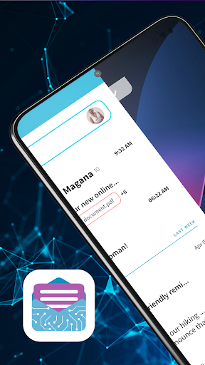
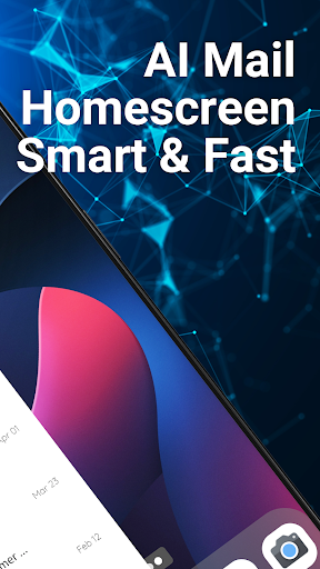
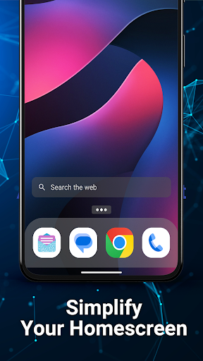
Easy Mail - Email Launcher
App Lab Studios
Editor's summary

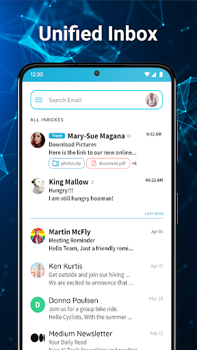
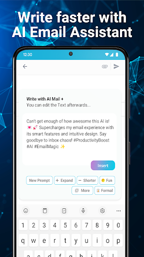
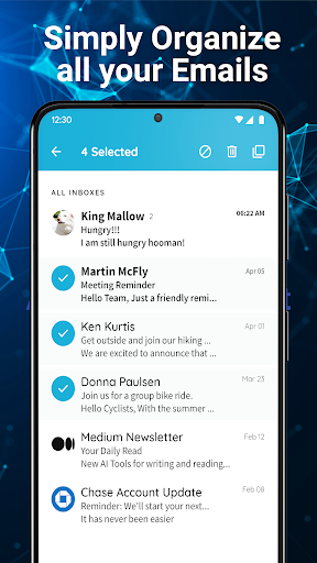
One-line summary Easy Mail is genuinely handy if you want your inbox one swipe from the home screen, but its launcher-first design will be a deal-breaker for anyone who just wants a normal email app without changing how their phone works.
-
Installs
1M+
-
Developer
App Lab Studios
-
Category
Personalization
-
Content Rating
Everyone
-
Latest version
1.02.52
-
Package
com.applabstudios.ai.mail.homescreen.inbox
Screenshots
In-depth review
Alternative apps
- Microsoft Outlook
- Blue Mail
- Spark Mail
Recommended Apps
-

Rise of Kingdoms: Lost Crusade
LilithGames4.4
-

djay - DJ App & AI Mixer
Algoriddim4.0
-
Neon LED Keyboard - RGB Lighting Colors
AZ Mobile Software4.7

-

ShortMax - Watch Dramas & Show
SHORTMAX LIMITED4.3
-

I Am Security
Estoty4.6
-

Avatar World ®
Pazu Games4.7
-
AVG AntiVirus & Security
AVG Mobile4.6
-
My Supermarket Simulator 3D
Game District LLC4.2
-

Audiomack: Music Downloader
Audiomack Music Apps4.7
-

Smashing Four: PvP Hero bump
Geewa3.9
-
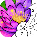
Color Time - Paint by Number
Nox Future Corp.4.6
-

Grubhub: Food Delivery
Grubhub4.5
-
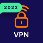
Avast SecureLine VPN & Privacy
Avast Software4.3
-

Weifu AI: My Girlfriend Chat
Vitality AI4.7
-

Melon Playground
TwentySeven4.6
You May Like
-

Fonts Keyboard
Fonts Keyboard4.6
-

Chat Style : Font for WhatsApp
Connect Apps Lab4.2
-
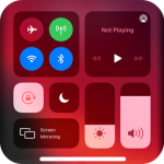
Control Center Screen Recorder
FA developer4.6
-

Parallel Space - Multiple acco
LBE Tech4.2
-
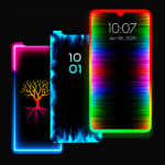
Edge Lighting - Borderlight
ZipoApps4.5
-

Fast Launcher
Innova Tool4.6
-
Neon Love Theme
Delicate theme for Android App4.7
-
Neon LED Keyboard - RGB Lighting Colors
AZ Mobile Software4.7
-

Make Money & Earn Cash Rewards
Mode Mobile: Make Money On Earn App4.2
-

Launcher iOS 16
LuuTinh Developer4.8
-
Zipper Lock Screen Wallpapers
Lutech Ltd4.2
-

Ringtone Maker:create ringtone
Big Bang Inc.4.6
-

X Icon Changer - Change Icons
ASTER PLAY4.2
-
Text Font Generator
Dricodes4.2
-
Cool Wallpapers HD Steampunk
Live Wallpapers and Emoji Keyboard Themes4.6