Apps Games Articles
GoFundMe: Fundraise and Give
GoFundMe Inc
Rating 4.7star icon
Editor's summary
Editor rating
star icon star icon star icon star icon
half star icon
4.5

One-line summary GoFundMe is one of the easiest ways to launch and manage a fundraiser from your phone, but you may still want a laptop nearby when the setup details and money-handling questions get a little too dense for a small screen.

  • Installs

    5M+

  • Developer

    GoFundMe Inc

  • Category

    Finance

  • Content Rating

    Everyone

  • Latest version

    11.2.0

  • Package

    com.GoFundMe.GoFundMe
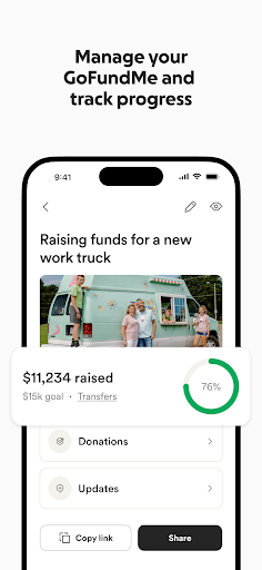
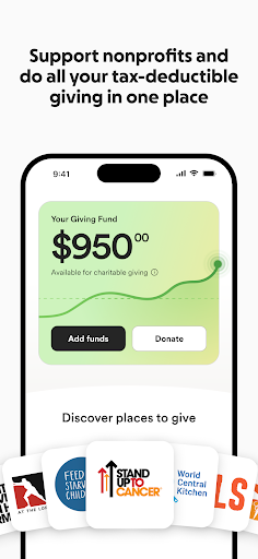
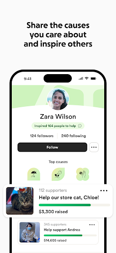
Screenshots
In-depth review
GoFundMe: Fundraise and Give feels like an app built around urgency. From the first few minutes of using it, that becomes its biggest advantage: it doesn’t bury the core action under endless menus or unnecessary fluff. If you need to start a fundraiser quickly for yourself, a friend, or a cause you care about, the app does a solid job of getting out of the way and helping you move from idea to live campaign with relatively little friction. In day-to-day use, the app is at its best when you treat it as a mobile command center. Creating a fundraiser is straightforward enough that most people should be able to get the basics done without much hand-holding. The flow feels guided rather than confusing, and it’s clear that the app is designed for people who may be dealing with stressful or emotional situations, not just casual browsing. We were able to move through the major setup steps without feeling lost, and the app does a good job surfacing the actions that matter most: building the page, sharing it, and keeping up with activity. That ease of use is the first major strength here. GoFundMe understands that many users are not power users. They are often people trying to organize help in a difficult moment, and the app’s structure reflects that. Navigation is generally simple, and the fundraiser management tools are easy to grasp once the campaign is live. Notifications are another strong point. For an app like this, timely alerts matter, and GoFundMe makes it easy to keep tabs on donations and updates without constantly opening the app to check manually. That constant sense of activity gives the platform some emotional momentum, especially when a campaign starts picking up support. The second strength is that the app feels trustworthy in its basic operation. We didn’t run into ad clutter, hidden upsell spam, or a design that seemed more interested in extracting attention than helping people organize support. That matters. In a category where users are often dealing with funerals, emergencies, medical bills, or community causes, a clean and focused experience goes a long way. The app presents itself with enough polish that it feels dependable rather than opportunistic. The third strength is support for both fundraising and giving. Even outside launching a campaign, the app tries to keep the broader act of helping in one place, including profiles and giving-related tools. That makes it more than a one-time utility. It can work as an ongoing hub for people who regularly donate or want to highlight causes they care about. If you’re the kind of user who likes to stay connected to multiple fundraisers and revisit them over time, that extra layer gives the app more long-term value. That said, GoFundMe is not frictionless, and the weak spots show up most clearly when you move beyond the basic happy path. The first complaint is that some parts of setup and management simply feel better on a larger screen. On a phone, the app is efficient for quick edits, monitoring activity, and sharing your link. But when you’re trying to work through all the details carefully, a laptop can feel more comfortable. This is not a deal-breaker, but it is noticeable. The app is mobile-friendly, not always mobile-perfect. The second issue is clarity around financial details. During setup and account preparation, there are moments where you may want more explicit explanation about deductions, percentages, or how long it takes to access funds. The app does not feel deceptive, but it can feel a little light on hand-holding exactly where users are likely to be most anxious. When money is the entire point of the app, any ambiguity around timing or fees stands out more than it would elsewhere. The third weakness is that the experience can occasionally feel brittle when something goes wrong. Even a polished app like this can lose goodwill quickly if a page hangs, loads poorly, or leaves you staring at a blank screen in the middle of setup. In our use, the core flow was mostly stable, but GoFundMe is the kind of app where even a brief glitch feels bigger because people often come to it at stressful moments. Reliability doesn’t just need to be good here; it needs to feel rock solid. Who is this app for? It’s for people who want a mainstream, accessible way to raise money quickly and manage that campaign on the go. It’s also for donors who want a simple place to follow causes and give without extra noise. If you value ease of use, fast sharing, and quick donation updates, GoFundMe is easy to recommend. Who is it not for? If you want a deeply detailed, desktop-grade management experience entirely on your phone, or if you expect every financial and administrative detail to be exhaustively explained in-app before you commit, you may find parts of it a little too light. It’s also not ideal for anyone with zero tolerance for occasional setup hiccups. Overall, GoFundMe succeeds because it understands the emotional context in which it is used. It is fast, approachable, and largely well judged. Its best moments are when it helps you act quickly and stay connected to support as it comes in. Its weaker moments come when the process gets more administrative and the app’s simplicity starts to feel a little thin. Even so, after spending time with it, we came away thinking this is one of those rare utility apps that does its main job well enough to matter: it helps people ask for help, and helps others respond with very little ceremony.
Alternative apps