Apps Games Articles
NAVICA
Abbott
Rating 4.5star icon
Editor's summary
Editor rating
star icon star icon star icon star icon empty star icon
4.3

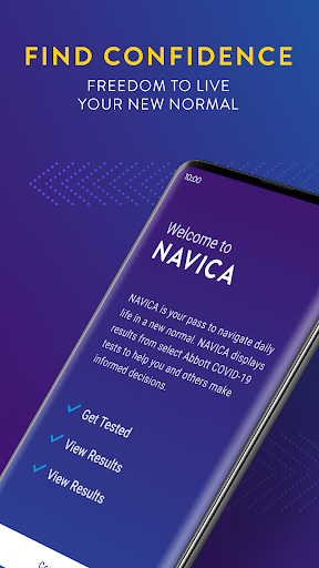
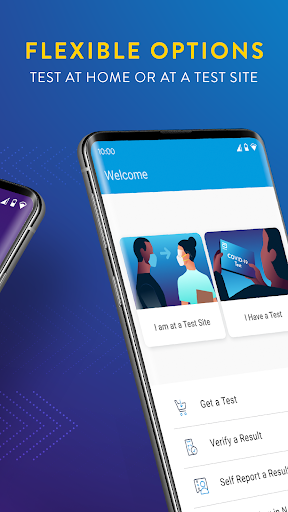
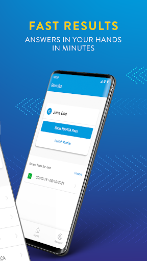
One-line summary NAVICA is easy to recommend if you want a straightforward health-status companion that gets you to your result screen quickly, but it is harder to love when you expect a broader, more flexible app experience beyond that core task.

  • Installs

    500K+

  • Developer

    Abbott

  • Category

    Medical

  • Content Rating

    Everyone

  • Latest version

    1.35.0-prod

  • Package

    com.abbott.ardx.navica.consumer.prod

Screenshots
In-depth review
NAVICA is one of those apps that feels built around a very specific moment: you need your health-related result or status information, you need it fast, and you do not want to dig through a maze of menus to find it. After spending time with it from that practical, real-world angle, the app comes across as focused, generally polished, and surprisingly approachable for something tied to a task that can already feel stressful. It is not trying to be an all-purpose wellness platform, and in many ways that narrow focus is exactly why it works as well as it does. The first thing that stands out is how direct the app feels. NAVICA does not give off the impression of being overloaded with lifestyle content, promotional clutter, or unrelated extras. That matters because most people opening an app like this are not in the mood to explore. They want clarity. On that front, NAVICA largely succeeds. The interface is clean enough to understand without much trial and error, and the path from opening the app to finding the information you need feels reasonably short. That sense of simplicity is one of its biggest strengths. In day-to-day use, it helps the app feel dependable rather than intimidating. A second strength is that the app generally handles a serious purpose with the right tone. Health-adjacent apps can easily become either too clinical and cold or too busy and consumerized. NAVICA lands somewhere in the middle. It feels functional first, which is what most users will want. We appreciated that it tends to present information in a way that feels accessible rather than technical. Even if you are not especially comfortable with medical or administrative apps, there is a good chance you can get through the basics without friction. The third clear positive is convenience. When an app is tied to documentation or status verification, portability matters almost as much as accuracy. Having that information on your phone is simply more practical than relying on paper, screenshots, or scattered emails. In actual use, that convenience becomes the reason the app earns its place on your device. It is the kind of app you may not open every day, but when you do need it, having it ready is genuinely useful. That said, NAVICA is not flawless, and its narrow focus creates some of its own limitations. The biggest issue is that the app can feel a little too single-purpose. If your needs line up exactly with what it is designed to do, the experience is smooth. If you expect more flexibility, deeper account tools, or a wider sense of control, it can start to feel restrictive. This is not the kind of app that invites exploration or rewards power users. It is transactional, and while that keeps it simple, it also makes the experience feel thinner than some people may want. Another weakness is that when an app like this hits even a small patch of friction, it feels larger than it would in a more casual app. If you are logging in, confirming information, or trying to pull up something time-sensitive, patience disappears quickly. NAVICA is mostly straightforward, but there are moments where the flow can feel more rigid than graceful. The app does not always give the sense of flexibility or hand-holding you might want when something does not immediately go as planned. For users under time pressure, that kind of friction stands out. The third complaint is less about any one feature and more about the overall feel: NAVICA is competent, but not especially warm or modern in the way top-tier consumer apps are. It does the job, but it does not always feel delightful. There is a difference between clean and bare, and at times NAVICA edges close to bare. That is not a dealbreaker, especially for an app in this category, but it does mean the experience can feel more utilitarian than refined. Who is NAVICA for? It is for people who want a simple, practical mobile companion for accessing and showing health-related status information without unnecessary distractions. It is especially good for users who value speed, legibility, and a focused interface over bells and whistles. If your ideal app is one that opens, shows you what you need, and gets out of the way, NAVICA fits that brief well. Who is it not for? It is not for users looking for a rich health dashboard, extensive customization, or a broader wellness experience. It is also not ideal for anyone who gets frustrated by narrowly designed apps that only shine inside a specific use case. If you want an app to do more than its core function, NAVICA may feel limited fairly quickly. Overall, our time with NAVICA left a positive impression. It understands the job it is supposed to do, and most of the time it does that job with enough clarity and speed to be genuinely helpful. Its strengths are not flashy, but they are the right ones: focus, ease of use, and real-world convenience. Its weaknesses are also easy to see: limited flexibility, occasional friction when you need everything to work immediately, and a somewhat plain overall feel. Still, for the user who needs exactly this kind of tool, NAVICA is easy to keep on the phone and easy to rely on. It may not be an app you love, but it is very likely an app you appreciate when it counts.
Alternative apps