Apps Games Articles
Microsoft Launcher
Microsoft Corporation
Rating 4.7star icon
Editor's summary
Editor rating
star icon star icon star icon star icon
half star icon
4.5

One-line summary Microsoft Launcher is easy to recommend if you want a cleaner, more organized Android home screen with a polished Microsoft-friendly feel, but I’d hesitate if you prefer a pure stock setup or don’t want your launcher nudging you toward an ecosystem.

  • Installs

    50M+

  • Developer

    Microsoft Corporation

  • Category

    Personalization

  • Content Rating

    Everyone

  • Latest version

    6.220502.0.1048930

  • Package

    com.microsoft.launcher
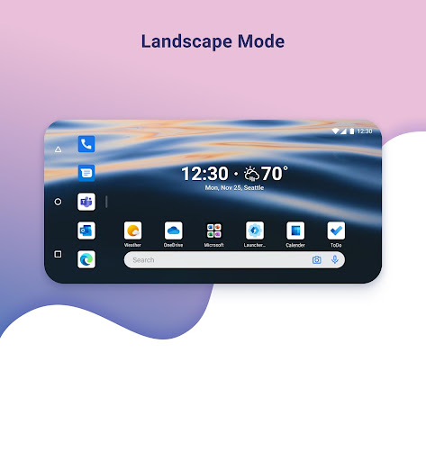
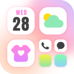
Screenshots
In-depth review
Microsoft Launcher is one of those Android apps that quietly changes the way you use your phone every day. After spending real time with it as my primary launcher, the biggest takeaway was simple: it makes Android feel tidier, calmer, and more intentional without demanding that you completely relearn your device. That matters, because a launcher lives at the center of your phone experience. If it gets in the way, you feel it constantly. If it works, you stop thinking about it and just enjoy using your phone. That is largely what happened here. The first thing I noticed was how approachable it feels. Some Android launchers lean so hard into customization that they become a hobby project. Microsoft Launcher takes a more balanced approach. It gives you room to shape the home screen to your liking, but it rarely feels chaotic. Icons, pages, widgets, and general navigation all come together in a way that feels orderly rather than over-designed. There is a real sense of polish in the day-to-day flow of opening apps, arranging the home screen, and moving around the interface. Its strongest quality is that it improves organization without making the phone feel heavier. Over time, I found myself reaching apps more quickly and keeping the home screen cleaner than usual. That may sound like a small win, but on a device you use dozens or hundreds of times a day, those little efficiencies add up. The launcher has the kind of design discipline that helps reduce visual clutter instead of adding to it. For anyone whose default home screen has turned into a messy warehouse of icons and half-used widgets, this is a meaningful upgrade. Another thing Microsoft Launcher gets right is consistency. A lot of launchers look good in screenshots but feel uneven when you actually live with them. Here, the experience stayed stable and predictable in normal use. Swiping around, launching apps, and managing home screen layout all felt dependable. That reliability is one of the reasons it has such wide appeal. A launcher should not feel experimental; it should feel like part of the phone. Microsoft Launcher comes surprisingly close to that ideal. The third major strength is its broad appeal for people who like productivity-oriented design. Even without overstating any one feature, the app clearly has a practical mindset. It is not trying to turn your home screen into a neon theme showcase. It feels built for people who want their phone to help them get to the right thing fast, stay organized, and avoid unnecessary friction. If you use your phone as a tool first and a toy second, this design philosophy lands well. That said, Microsoft Launcher is not perfect, and its trade-offs become clearer the longer you use it. The first weakness is that, polished as it is, it can sometimes feel a little impersonal. The design is clean, but it is not especially warm or playful. If you love a home screen that feels highly expressive, quirky, or deeply personal in a visual sense, Microsoft Launcher may come off as a bit too controlled. It is functional elegance more than personality-driven charm. The second complaint is tied to its identity: the app feels best if you are already comfortable with Microsoft’s broader style and approach. It does not mean you need to be fully invested in that world to use it, but the launcher’s character is unmistakable. If you are allergic to ecosystem branding or simply want a launcher that feels completely neutral, this one may not fully disappear into the background. That subtle sense of being guided toward a particular software philosophy is not intrusive, but it is there. The third drawback is one that applies especially to Android enthusiasts: if you want extreme control, Microsoft Launcher may stop just short of being exciting. It offers customization, but it does not feel like it is trying to win over the most obsessive tweakers. In practical terms, that means many users will find exactly the right amount of flexibility, while power users may eventually feel the edges of the sandbox. I never found it restrictive for normal use, but I also never felt that thrilling sense of endless possibility that some niche launchers deliver. Who is this app for? It is for Android users who want a more polished and organized home screen, especially those who value clarity, productivity, and an interface that behaves predictably every day. It is also a good fit for people who are tired of a cluttered default launcher and want something that feels mature without becoming complicated. Who is it not for? It is not ideal for people who want the lightest possible stock experience with no added identity, and it is not the best match for users who treat launcher customization as an art form and want to endlessly tune every corner of the interface. If your priority is maximum personality or maximum tweakability, this may feel a little too restrained. Overall, Microsoft Launcher earns its reputation because it handles the basics exceptionally well. It makes Android feel more organized, more polished, and easier to live with. Its weaknesses are real, but they are mostly the result of a clear design philosophy rather than sloppy execution. After using it as a daily launcher, I came away impressed by how often it quietly improved the phone experience without calling attention to itself. That is exactly what a good launcher should do.